Digital Storytelling Project Reflections and SWOT Analysis
This project, entitled 'Digital Storytelling' focused on editorial illustration and making artwork for a commercial purpose. Unlike other projects, this centred on the final outcome, to produce a magazine cover and double-page spread for British film magazine company, Little White Lies. Founded in 2005, it distributes bi-monthly magazine worldwide, each with a cover design inspired by a feature film. I started the project with research of Little White Lies and other magazines with heavily illustrated covers, comparing how design influences have evolved through time and how companies cater to their target audience. With predominantly hand-rendered graphics, I wanted to take advantage of traditional materials and experiment digitally with various compositions and styles.
At the begging of the project, we were given three films to choose from: 'The Birds' (Alfred Hitchcock, 1963), 'Tetsuo: The Iron Man' (Shinya Tsukamoto, 1989) and 'The Grand Budapest Hotel' (Wes Anderson, 2014). After watching and reviewing all three films, one stood out I decided to continue with The Grand Budapest Hotel as I loved the distinct characters, cinematography and props, there was so much to take inspiration from so I thought it would be fun to work with. Also, I thought the visuals would communicate well with the editorial outcome.
The Grand Budapest Hotel is a comedy film written and directed by the highly regarded American filmmaker, Wes Anderson in 2014. Known for his eccentric approach to filmmaking, this film follows M. Gustave, a hotel concierge who befriends and lobby boy, taking him under his wing on a whirlwind adventure around Zubrowka as he's on the run after being framed for murder. I hadn't seen the film before but enjoyed watching it and was drawn to Tony Revolori's character 'Zero' and his suspicious yet kind-hearted nature. His infatuation for Agatha the baker and unconventional friendship with the hotel's concierge, M. Gustave, I felt drove the storyline and I wanted my designs to reflect these connections. The film is a source of inspiration for many artists so I needed the visuals to break away from film replicas.
 |
| Final cover design for 'Little White Lies' |
Through research, I found artists linked both to editorial illustration and filmmaking. Annie Atkins produced all the hand-rendered props for 'The Grand Budapest Hotel', working alongside Wes Anderson to bring the scenes to life and make Zubrowka a believable place. I loved seeing her work and watching her process on the Adobe Max 2020 Conference, seeing how she uses calligraphy and ages papers to make authentic letters and signage. This inspired me to make postcards and traditional ink assets to include in my magazine spread. Another artist, Luiz Mazon, who produced illustrations for Little White Lies directly inspired my process. He used a surrealist style to create artwork for the 'Call Me by Your Name' issue, utilising traditional mediums like oil pastel and gouache. This swatch technique helped create visual interest and a lot of contrast- well suited for editorial illustration as it is impactive and I wanted my cover to reflect these qualities. Over the last 8 weeks, I've done a lot of experimentation, both digitally and traditionally. Although it's been tough at time to figure out compositions and colour schemes, I feel like I've learnt a lot and bettered my understanding of editorial illustration and portraiture. Through using ink, I was able to scan each asset and play out with colours and positioning on Photoshop, aided by a group critique I participated in. This was beneficial to see my work from other perspectives as it’s easy to get wound up when you're looking at the same composition for too long. It highlighted a few things about colour saturation and additional ink assets I could create to help add continuity.
 |
| Double-page spread |
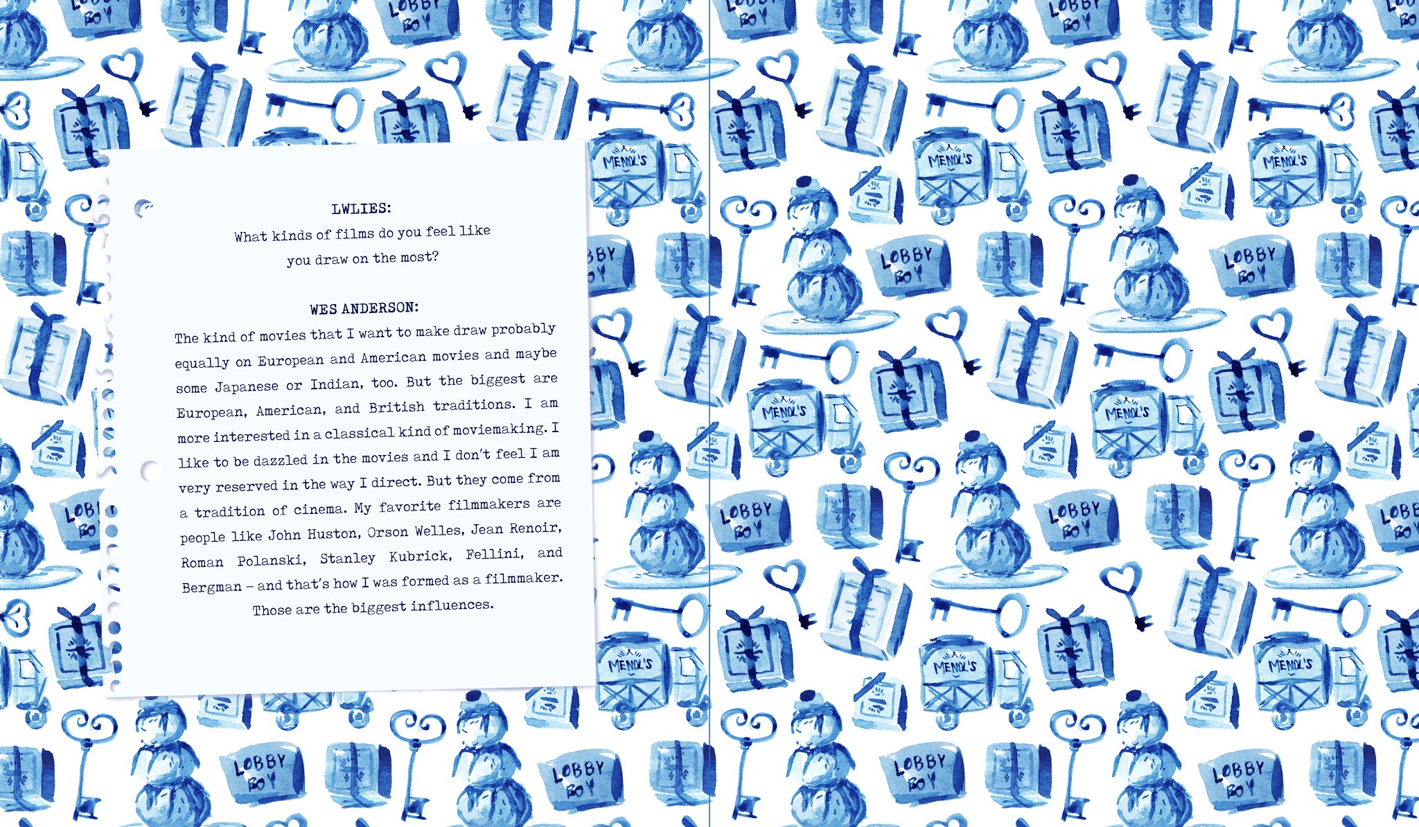
Overall, I enjoyed this project and having the opportunity to explore editorial illustration as it’s an avenue I could pursue beyond university. I also tagged Little White Lies (@LWLies) in some of my cover designs on Instagram and they liked the pictures, so it was great to engage with them through this platform. Editorial is about engaging with an audience and making artwork that appeals to the correct demographic and I feel like I succeeded in doing this. Being in the demographic of Little White Lies readers, as well as the people in my class and tutors, it was helpful to get positive and constructive criticism and helped with my decision making. Although there was a lot of experimenting with the cover background, going from a busy repeating pattern to stripped back paint stroke composition, I think the three outcomes complement each other well. With good time management, I was able to use the repeat pattern as the endpages with an interview with the director, Wes Anderson. This can be seen in all Little White Lies issues and is a recognisable feature of film magazines. Paired with the front cover and spread it adds to the context and uses more of the assets I've created. I'm looking forward to exploring editorial illustration further and becoming more confident in choosing colour schemes and visualising compositions.
 |
| Endpages |
SWOT Analysis
Strengths-
- I've explored many design avenues backed up with research of artists, editorial illustrators and publications. Everything related back to Little White Lies, making sure I didn't go off brief and the outcome would relate to the target audience.
- Action plan helped me keep on track of progress and what I wanted to achieve weekly. Beneficial to see how my project has developed leading to the final weeks.
- Feedback from group critiques helped with colour choices and composition, also good to engage with other creatives and give constructive feedback.
- My outcomes have an integrated narrative, focused around Zero and Agatha's relationship. I like how all the elements link thematically.
Weaknesses-
- Not having access to the Risograph printer in the studio and other facilities, using the pink and purple in a more abstracted way to represent the characters.
- More exploration of portraits, I could have utilised the first few weeks to try more materials and learn how to create portraits in different ways. I'll continue to work on this in personal work which will benefit my skillset for producing children's books.
Opportunities-
- To explore a different creative avenue, understand the elements that go into editorial illustration.
- Engagement on social media with Little White Lies, having the opportunity to link directly with them and other creatives to get feedback.
- Improved Illustrator skills, working with hand-rendered elements and combining them digitally using the wireframe and assets provided.
Threats-
- Working remotely, I was more reliant on self-motivation and not getting as much contact with people in the studio.
- I found it difficult to figure out the cover composition so spent weeks working on different outcomes. I wanted my work to be recognisable in relation to 'The Grand Budapest Hotel' without being a replica of the film or other 'fan' artwork created.


Comments
Post a Comment