Weekly Update- Digital mock-ups
Continuing on from my last post, I've been refining my concepts and working on the 2-page magazine spread, finding ways to integrate the text and illustrations seamlessly. This project focuses on the final outcome so all assets and research link to the theme, which is a different way of working as I'm used to looking at a theme from different angles then narrowing ideas down. That said, I've enjoyed exploring different themes and characters in The Grand Budapest Hotel and feel I've gained a good understanding of the film over the past few weeks.
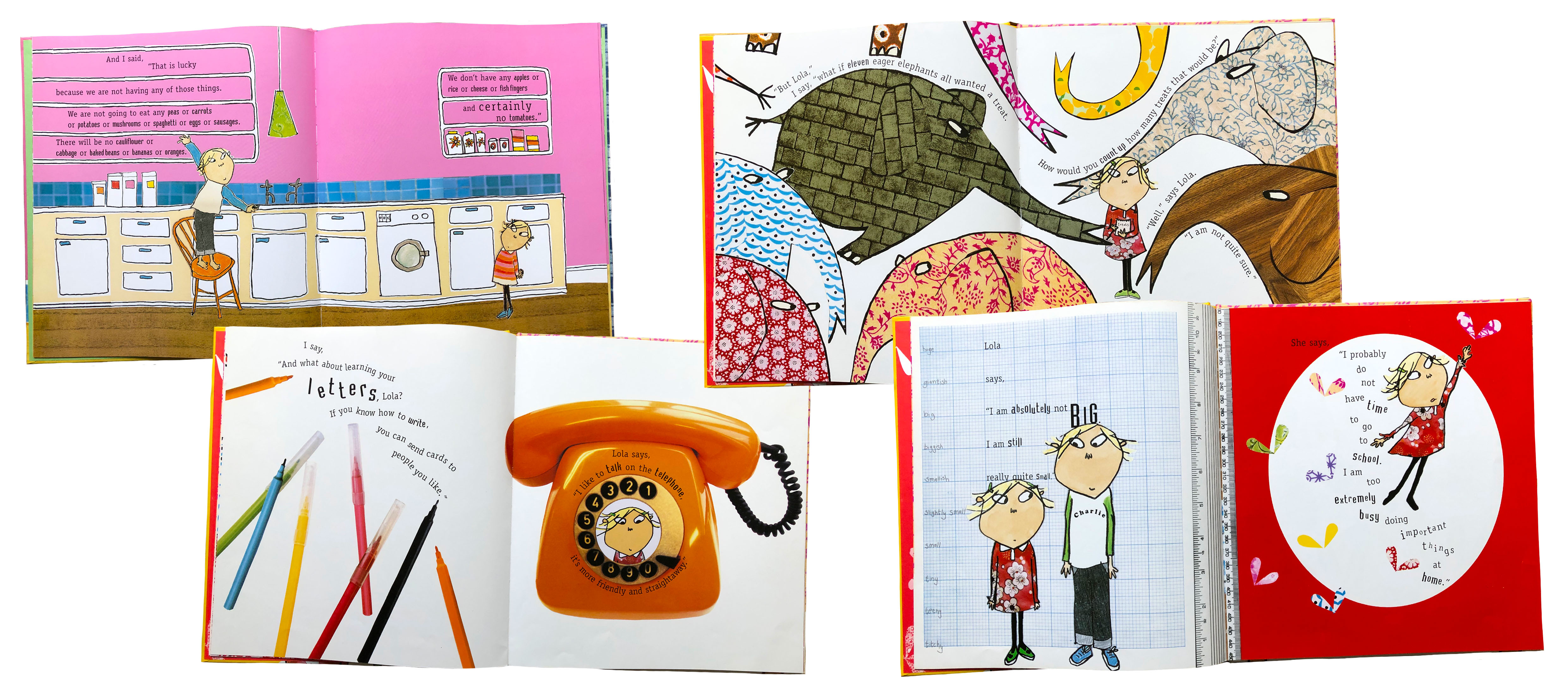
Coming into the final weeks of the project, I've focused on making assets for the magazine using ink to create continuity between the cover and interior illustrations. This has been aided by looking at the work of author and illustrator, Lauren Child, who is most recognised for making bestselling children's books such as 'Charlie and Lola' and 'Clarence Bean'. Laurens ability to create such humorous and charming stories following the mundane lives of a young brother and sister has always inspired my love for storytelling, taking a simple concept and building a world around it. As a child I didn't see much past the funny characters and pretty patterns of Charlie and Lola's world, however, after revisiting it recently I've loved reading about how the characters came into existence and more about the thought process Child takes in creating the stories and illustrations.

In relation to my brief and The Grand Budapest Hotel, I focused on the use of typography, with sentences integrated into the compositions. The text runs seamlessly through the pages which inspired me to look at how to combine the quote into my magazine pages. I wanted to focus on relationships, both the young romance between Zero and Agatha and unlikely friendship between Zero and Gustave. To match this theme, I chose the quote, 'For my dearest darling, treasured, cherished Agatha, whom I worship. With respect, adoration, admiration, gratitude, best wishes and love from Z to A'. The quote shows Zero projecting his love for Agatha which was the underlying theme I wanted to reflect in the imagery. In the designs below, you can see how I've played around with this and tried to find solutions to combine all elements seamlessly.
 |
| Concept 1 |
 |
| Concept 2 |
 |
| Concept 3 |
 |
| Concept 4 |
By using traditional mediums like ink and scanning each element, I was able to combine them all in Illustrator and erase the backgrounds to make them transparent layers, perfect for layering and playing around with- this became quite confusing when I had about 30 graphics in one Illustrator file! Through this project, I've got a lot better at using Illustrator and using hand-rendered and digital processes harmoniously.
For example, in the first few concepts, I used digital type in the illustrations then decided to print out those elements and use the lightbox to replicate them in ink. This way, they had the same character and fluidity of the illustrations which ended up looking a lot better. I followed a similar process with the postcard design. Before producing these mock-ups, I was creating assets inspired by Annie Atkins, a prop designer who worked on 'The Grand Budapest Hotel' alongside Wes Anderson. By combing an ink quote and these postcard designs I'd produced, I was able to make it look like I had (or Zero had) written the message straight onto the postcard by using the multiply tool in Photoshop to get rid of the white background. These small details, in my eyes, are what make something believable, like how Atkins creates realistic props for the movie. I was pleased with how this turned out, especially in the mock-ups above being used as the panoramic illustration. It also reflects how other artists have approached the Little White Lies editions, creating original artwork based on the movies. Luis Mazon, for example, for the Little White Lies 'Call Me By Your Name' edition, using a surrealist approach to the illustrations to represent the vibrant colours of the Italian countryside.
 |
| Assets created for the magazine spread, illuminated letter, quote, title and review elements all using ink to tie in with the fluidity of the illustrations and surrealist approach to the front cover portrait. |


Comments
Post a Comment