Weekly Update and Tutorial Review
Since my last progression post a few weeks ago, I've developed a better understanding of the Arctic through research and mind-mapping therefore have a much clearer idea of what I want to focus on. Recently I've spent a lot of time writing blog posts on artists that have inspired my progress; these include Darren Mundy, Jon Klassen and Mary Blair. From Blairs use of unapologetically vivid colour in illustration to Klassen's simplistic characters and humourous storytelling, to Mundy's enchanting paintings. I've enjoyed this new platform to document research in a more personal and informal way. It also allows my illustrative and experimental work to have a prominent feature in my sketchbook over pages of research. On a side note, I've had two more life drawing sessions focusing on mixed media, lighting and portraiture. With portraiture being something I'm not used to, I was sceptical but with a much longer time frame of 1 hour 45 minutes, I really enjoyed it and feel my outcome turned out well. I was limited to using 3 chalks for this piece (blue, orange and pink) so it was challenging figuring out which ones to use for the highlights, mid-tones and shadows. Below is the final outcome.
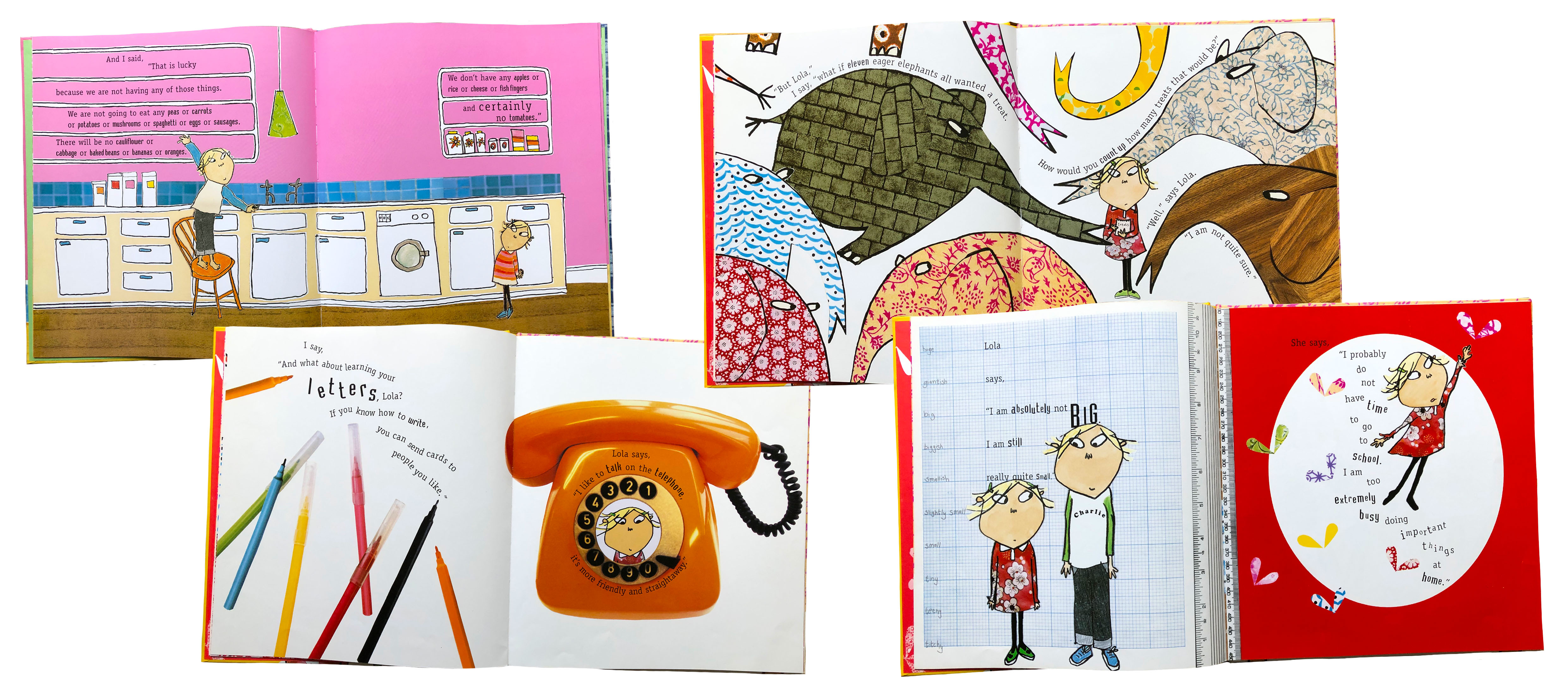
For my development, I decided to experiment with college as its something I've enjoyed using in previous projects but never utilised for a final piece. This week I painted and printed textures using watercolour, acrylic paint and ink. By using different brush sizes and sponges it produces dappled/ speckled effects to reflect the environment and elements in it. For example, the fine speckled texture was good for sand and the lighter parts of characters to add contrast. I was inspired by Jon Klassen's textured illustrations and curious as to how he achieved this effect, so I decided to try combining traditional and digital methods. With the textures scanned and on my Surface, I began playing around with the lasso tool on Photoshop and laying them to see what worked best. I had sketches of Eskimos I'd produced previously, so I began using darker textures to create the basic shape of the coat, boots and face. From here, I layered alternate textures on top to create detail in the coat with buttons, fur and patches- the same process for the face, with Inuit paint markings and facial features. I enjoyed the process as it allowed for mistakes to be made in the cutting out of textures, making the outcome more unexpected than drawing something perfectly. After producing a series of Eskimos, I created a penguin and reindeer along with simple rock shapes to help build up the composition. It's quite an addicting process! I love how the textures add a new dimension and have a stronger visual impact on the viewer as it's a less familiar process. Relating to my final piece, I want to take influence from Oliver Jeffers and Jon Klassen in their simplicity, focusing more on the composition. The triptych should capture a journey through time to the present day, showing the negative effects of rising sea levels on the animals and Inuit tribes worldwide, but more specifically in the Arctic. My current plan is for the triptych to be three portrait panels showing the water level rising over time, either with the horizon line staying constant through the panels or the iceberg gradually moving down.

In addition, I've looked at the National Geographic 'Arctic' and 'Planet or Plastic' magazine editions as I have the yearly subscription. I love how each one edition focuses on a current issue. The Arctic magazine had an interesting story about the Inuit tribes of the Canadian Arctic whos culture and lifestyle differ greatly from what we're used to. The story entitled 'The Cold War' written by Neil Shea with the perspective of living among the tribes. It spoke of their traditions being passed down to the next generation, without these skills like ice fishing and hunting would be forgotten. From this research (spoke of more in detail in my sketchbook), I referenced aspects of their lives into my triptych panels, including traditional teepees and boats made of found materials in regard to Inuits living off the land. I aim for my outcome to reflect the environmental issues of plastic pollution and rising sea levels without being too forceful or campaigning. This could influence how the buildings and underwater landscape are impacted and created.
Tutorial Review
In this weeks tutorial with my tutor, we discussed my development and the next stages of the project. At this stage, my sketchbook is progressing well with media testing and thumbnails ideas underway. I've completed all the artist research relevant to the context and style of my work. This has helped me gain a good understanding of the composition I hope to achieve, with a clear vision of how the water is rising over time. Over the Christmas break, I plan to develop my rough concept sketches into 3 final illustrations ready for colourisation; this will probably be a mix of traditional textures, enhanced and composed digitally.
In previous projects, I've created very detailed illustrations so I want to focus more heavily on a clever composition, similar to 'The Fate of Fausto' book by Oliver Jeffers who's very talented at creating an atmosphere simplistically. To be able to turn my drawings into digital collages, I'll need more textures to build up the iceberg and smaller details of the landscape. I also need to decide on a colour scheme; the textures can be altered with a gradient map digitally but I want to keep sepia as the primary colour, then add others for main elements like the lighthouse, boats and sea. Overall, I think I'm on track and have managed my time well so far, with an aim to finish my 3 compositions over the Christmas break. This way, I'll have two weeks to produce the digital collages and finish any annotation in my sketchbook.
 |
| A portrait produced in coloured chalk |
For my development, I decided to experiment with college as its something I've enjoyed using in previous projects but never utilised for a final piece. This week I painted and printed textures using watercolour, acrylic paint and ink. By using different brush sizes and sponges it produces dappled/ speckled effects to reflect the environment and elements in it. For example, the fine speckled texture was good for sand and the lighter parts of characters to add contrast. I was inspired by Jon Klassen's textured illustrations and curious as to how he achieved this effect, so I decided to try combining traditional and digital methods. With the textures scanned and on my Surface, I began playing around with the lasso tool on Photoshop and laying them to see what worked best. I had sketches of Eskimos I'd produced previously, so I began using darker textures to create the basic shape of the coat, boots and face. From here, I layered alternate textures on top to create detail in the coat with buttons, fur and patches- the same process for the face, with Inuit paint markings and facial features. I enjoyed the process as it allowed for mistakes to be made in the cutting out of textures, making the outcome more unexpected than drawing something perfectly. After producing a series of Eskimos, I created a penguin and reindeer along with simple rock shapes to help build up the composition. It's quite an addicting process! I love how the textures add a new dimension and have a stronger visual impact on the viewer as it's a less familiar process. Relating to my final piece, I want to take influence from Oliver Jeffers and Jon Klassen in their simplicity, focusing more on the composition. The triptych should capture a journey through time to the present day, showing the negative effects of rising sea levels on the animals and Inuit tribes worldwide, but more specifically in the Arctic. My current plan is for the triptych to be three portrait panels showing the water level rising over time, either with the horizon line staying constant through the panels or the iceberg gradually moving down.
In addition, I've looked at the National Geographic 'Arctic' and 'Planet or Plastic' magazine editions as I have the yearly subscription. I love how each one edition focuses on a current issue. The Arctic magazine had an interesting story about the Inuit tribes of the Canadian Arctic whos culture and lifestyle differ greatly from what we're used to. The story entitled 'The Cold War' written by Neil Shea with the perspective of living among the tribes. It spoke of their traditions being passed down to the next generation, without these skills like ice fishing and hunting would be forgotten. From this research (spoke of more in detail in my sketchbook), I referenced aspects of their lives into my triptych panels, including traditional teepees and boats made of found materials in regard to Inuits living off the land. I aim for my outcome to reflect the environmental issues of plastic pollution and rising sea levels without being too forceful or campaigning. This could influence how the buildings and underwater landscape are impacted and created.
Tutorial Review
In this weeks tutorial with my tutor, we discussed my development and the next stages of the project. At this stage, my sketchbook is progressing well with media testing and thumbnails ideas underway. I've completed all the artist research relevant to the context and style of my work. This has helped me gain a good understanding of the composition I hope to achieve, with a clear vision of how the water is rising over time. Over the Christmas break, I plan to develop my rough concept sketches into 3 final illustrations ready for colourisation; this will probably be a mix of traditional textures, enhanced and composed digitally.
In previous projects, I've created very detailed illustrations so I want to focus more heavily on a clever composition, similar to 'The Fate of Fausto' book by Oliver Jeffers who's very talented at creating an atmosphere simplistically. To be able to turn my drawings into digital collages, I'll need more textures to build up the iceberg and smaller details of the landscape. I also need to decide on a colour scheme; the textures can be altered with a gradient map digitally but I want to keep sepia as the primary colour, then add others for main elements like the lighthouse, boats and sea. Overall, I think I'm on track and have managed my time well so far, with an aim to finish my 3 compositions over the Christmas break. This way, I'll have two weeks to produce the digital collages and finish any annotation in my sketchbook.
 |
| Illustration from 'The Fate of Fausto' by Oliver Jeffers |

Comments
Post a Comment