Reflections on Character Design and SWOT Analysis
This project was about character design, looking at developing personality relating to their surroundings and archetype. As a keen lover of children's book illustration, I enjoy creating characters and building a narrative around them but struggle with angles, proportion and how to show a character interacting within a scene. This was something that I wanted to learn more about in this project.
In the first week, we were introduced to character archetypes which are the core traits, values and responses that generate a certain personality type. From here, I started researching all of them and figuring out which ones I wanted to focus on. I had to choose an existing story from either Grimm Fairytales, Folklore, Norse Mythology or Greek Legends to recreate characters from. After reading stories from each category, I decided that Grimm was best suited and thought the stories had the most imagery to explore. Growing up I've read a few Grimm stories and am familiar with the Disney Fairytale versions but I wanted to find a less popular story that hadn't been retold before. This way, I wouldn't be caught up in existing imagery and could start from scratch, generating new characters based solely on the narrative. In the end, I chose to go for a story called 'Fundevogel' which combined a few plot types.
 |
| Sketches inspired by the Grimm Fairytale 'Fundevogel' |
To summarise a typically disturbing Grimm Fairytale, 'Fundevogel' begins as a forester finds a young boy in a tree after he's been snatched from his mother by a bird of prey. The forester takes him home to grow up with his daughter Lina. Time passes and Lina hears the cook (a witch) is planning to boil Fundevogel so the pair run away together into the forest. Servants are sent to find them but Lina uses her powers to transform them into a rosebush, church and finally a pond- hiding in plain sight. The cook resorts to going after the children herself and ends up being drowned by them in the pond. Although the original story is quite disturbing, I liked the characters, setting and strong friendship between Lina and Fundevogel who both chant through the story, 'Never leave me, and I too will never leave you.' I wanted to aim the story at children, so I altered certain scenes to emphasise elements of magic with the children finding magical forest creatures on their way home.
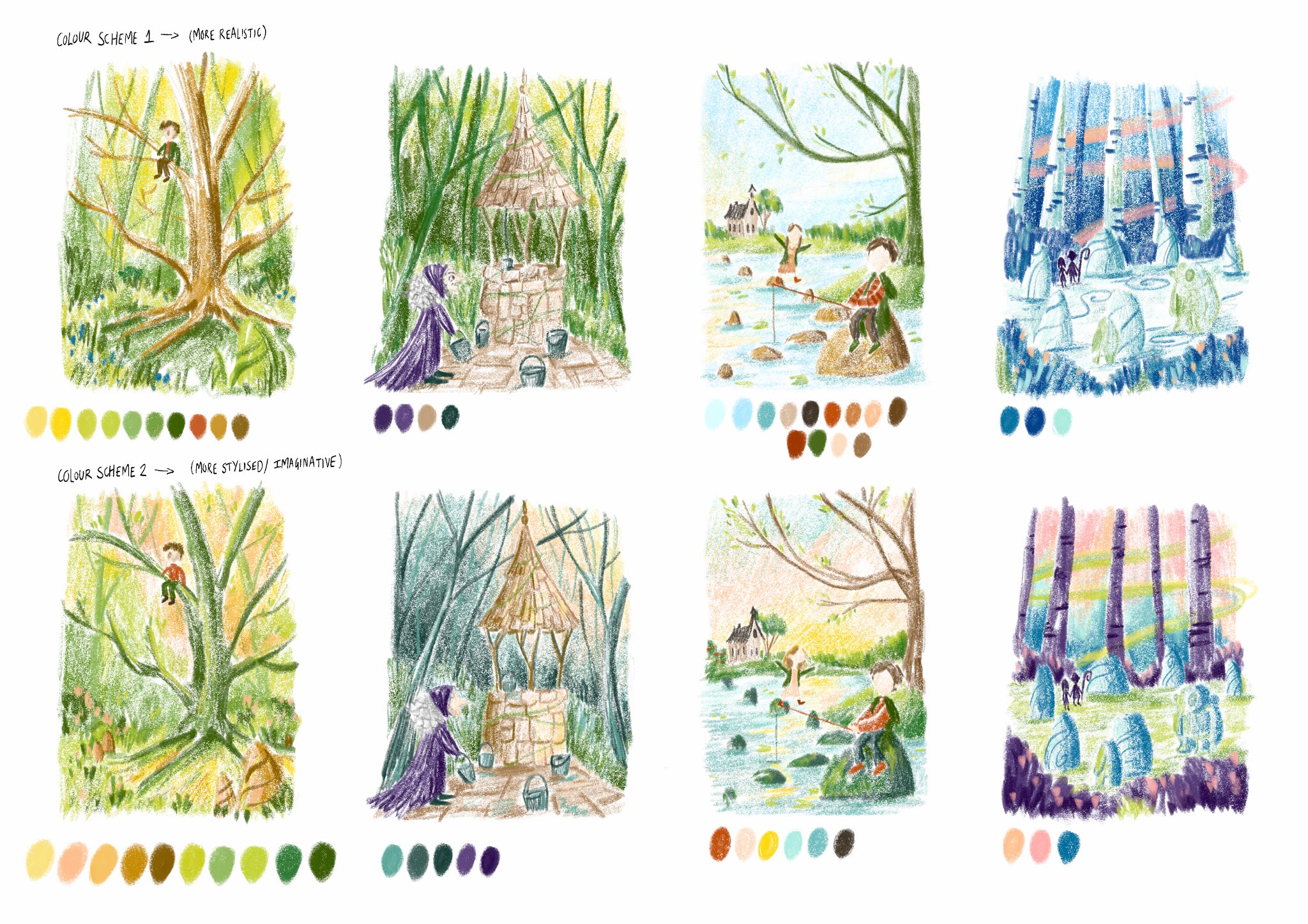
Since this project focused on designing characters rather than the environment, I worked on each character's personality, creating visual mood boards to inspire their clothing, colour schemes, iconography and props. This was a fun but challenging project as I'm not used to designing human characters. This process was aided by my research of Oana Befort and Beatrice Blue, two artists who use props and colour theory to portray certain archetypes. Beatrice Blue's illustrations focus heavily on the explorer archetype with adventurous protagonists; she uses rich blues and yellows to connote wonder and the happiness adventure brings to the characters. These contextual details help add narrative which was a key feature I wanted to depict in my illustrations, showing how the characters longed for adventure and were stronger together. Other influences came from Pinterest sourced imagery, primary imagery and Mary Blair, original concept artist for The Walt Disney Studios, who inspired me to try digital painting and think about how the characters with interact with the environment.
When designing the characters, I kept relating back to the story and thinking of what scenes would work well for the final. I've always loved the narrative element and adding lots of detail for the audience to find so they feel immersed in the story. Therefore, I decided to do 4 illustrations that took the viewer on a journey through the forest, following how the characters escape danger and find the woodland creatures. The story was too broad to choose only one illustration so I wanted to be a bit more ambitious and create illustrations that could be seen in a book, possibly with a book cover if I had time. Luckily, I managed to get all of this done and was pleased with the outcome. I think it adds a modern slant to the classic and presents each character well, with Fundevogel being shy and scared in the first panel when he is found in the tree, to him and Lina playing in the river together where he appears hopeful and content.
Conclusion and SWOT Analysis
To conclude, I think I learnt a lot during this project and became more comfortable with designing characters. With more time, I would have liked to explore printmaking further and looked at producing monoprints, maybe with each element separately then pieced together. Jon Klassen is a picture book maker and author who uses this technique effectively, combining shapes and texture to create simplified landscapes. I want to explore this idea further and look at combining traditional printing methods with narrative elements. I think my final illustrations show the use of colour connotations well, thinking about how the witch brings a negative atmosphere with a purple cloak and gloomy skies whereas the yellow, brighter colours used in panel 3 portray hope for the children escaping.
Going forward, I want to take what I've learnt about proportions and character posing to my next projects to become more confident with it. I enjoyed this project and think the work I've produced links to the children's publishing avenue I hope to pursue, with fun details and characters that would appeal to a younger audience.
 |
| Book Cover Concept |
Strengths-
- Good problem solving, tried something new with traditional mixed media outcomes. Ended up working better and I learn a lot from the process.
- Use of media testing throughout.
- All development backed up by relevant artists and research to produce illustrations and mood boards.
- Use of weekly action plan to stay on track, making sure I was covering everything required and making time for experimentation.
Weaknesses-
- Limited 6-week time frame, didn't get to do as many posing studies as I'd planned.
- Posing and proportion, going from learning about realistic proportions and adapting that for a children's book context. Something I want to continue working on, figuring out how to capture the same emotion and expressions in a simplistic way.
Opportunities-
- I'd like to continue exploring figure drawing, do more workshops and watch Youtube 'Fundamentals of Anatomy' classes to become more confident.
- Good work for my portfolio in relation to children's publishing.
Threats-
- My constant struggle with figuring out how to do the final pieces! There are too many processes I enjoy mixed with the fact I always prefer rough sketches, it takes a while to figure it out and stay true to the style I want. Doing more personal work will help with this.


Comments
Post a Comment