Cheltenham Illustration Competition
After finishing my final university project, I decided to take part in the Cheltenham Illustration Competition after hearing about it from my tutor. I'm planning to hand in my project this week then I'll be able to focus on this until the deadline on the 15th of June. I hadn't heard of the competition until recently but it seemed like something I'd like to take part in and would be a good way to use my spare time. This year's theme is 'I am many stories' and can be interpreted in any way in a narrative context. Over the years, this competition has grown and is well known worldwide, with annuals being sent as far as the US, Russia and China! I loved the idea of creating something to be used in a commercial way to be published in the 2020 annual and part of the touring exhibition. Therefore, I set to generate some ideas and decided to compile them in a post to show the process and work I've done behind the scenes.
Before going further into the idea I chose, here are some of the ideas I had (mostly so I can remember and come back to them later!)
- My initial thought when hearing the theme was 'I am many stories' was to do something relating to memories and how each person's characteristics and personality is altered by their life experiences. Possibly looking at families through generations and the generational gap between grandchildren and grandparents, with their contrasting childhoods. Looking at how war affected the children and how children today have adapted to the advances in technology and lifestyle.
- Look at the theme of stories, myths and legends passed down or ones that we've grown up with such as the Loch Ness Monster. Could be set on a lake with fishing boats circling what they think is driftwood but turns out to be the monster hidden in plain sight, looking at how things appear when we're not actively looking for them.
- Evolution and how animals have become extinct. The dodo is a key figure of evolution and it being hunted to extinction in 1662. Looking at the impact of humans on other animal species, how we have a huge influence on their surroundings. Could be translated into a children's book narrative with the tables turned and Dodos teaching people about how to look after their surroundings.
- A more personal approach looking at stories relating to me, I've always loved children's books and visiting places like Seven Stories in Newcastle where I remember reading stories on the top floor in the den with a huge colourful armchair covered in fur and blankets. I remember it being called the Gruffalo chair and this was something that I wanted to explore further in this brief as it has a personal link to my childhood.
Going forward from these ideas, I thought about the story of colour theory and how colours have an important part in branding, advertising and illustration with colours being chosen to connote a particular meaning. Colour theory is something I've found interesting since researching the Bauhaus in more detail and knowing how it has been used through art movements. I was thinking about the different colour groups, primary, secondary and tertiary and what it would be like if each group and colour had a personality. For example, the primary colours, red, yellow and blue, would be wise and knowledgeable, they see themselves as the originators, creating all other from the three colours. I then thought about secondary colours and how they would be playful, experimental and see the world as less black and white if that makes sense. Fresher eyes make for a more open mind. Tertiaries, on the other hand, see themselves as superior, with their muted tones they don't see the need to learn as they have the combined information of each colour that formed them.
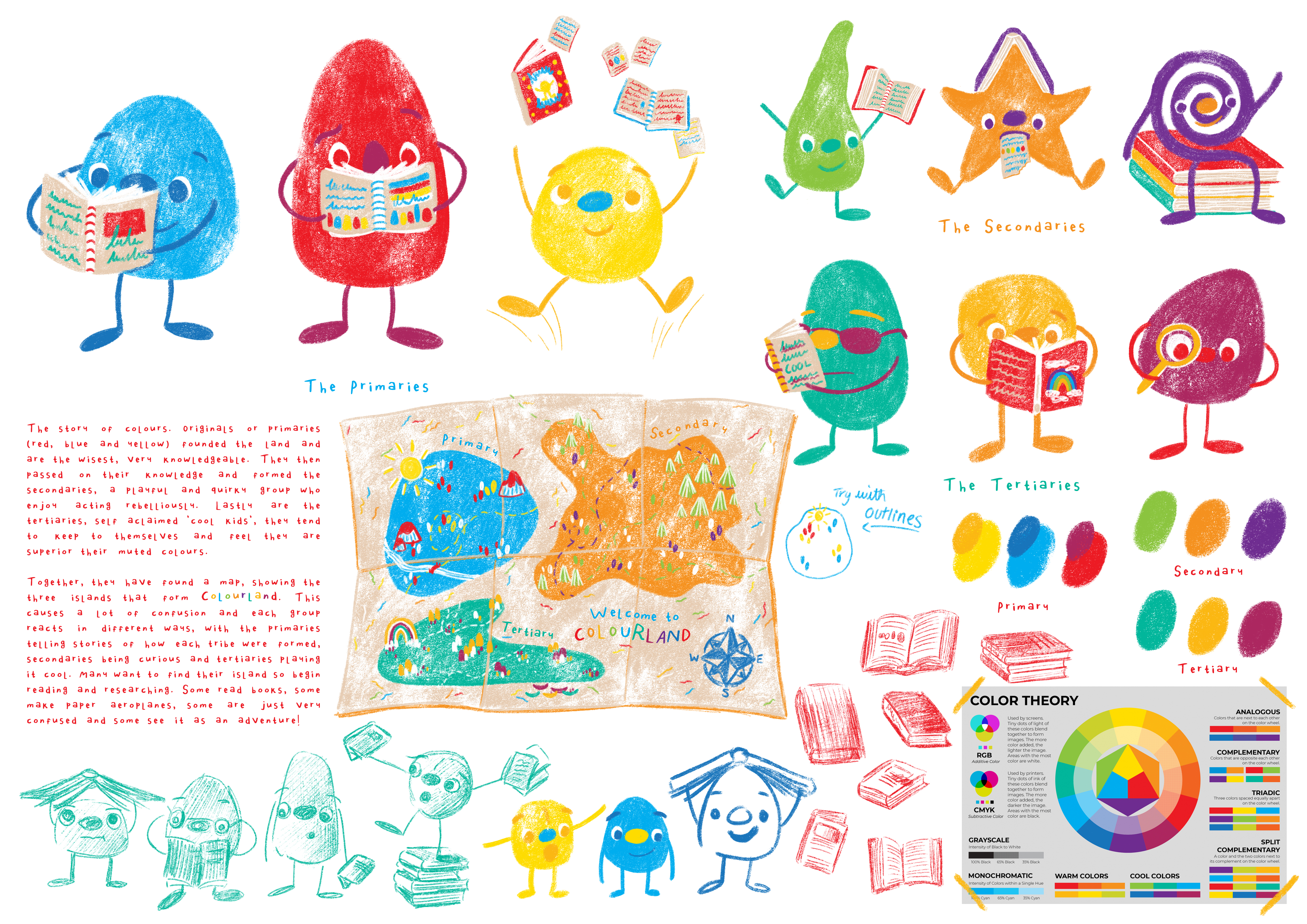
From the original concept, I started sketching and came up with 9 characters representing the 9 main colours on the colour wheel. I wanted the overall shapes to reflect how someone would do a colour swatch or use watercolour in a blob so the colour stands out more than the character. In regards to the brief, I liked the idea of the characters finding a map of 'Colourland' and wanting to find out which of the three islands they come from. It was fun to visualise this map abstractly with each island representing one of the colour families and using the reflective colour schemes.
The competition parameters say the illustration can be either landscape or portrait and no bigger than 40x50cm, so I thought of having the characters in a sort of grid as seen below, with each character interacting with books in different ways according to their personalities, explaining why some characters are ripping up the books. Although I love this idea with the simplicity of character and experimenting with colour schemes, I feel it would be better represented in a narrative context, similar to a Jon Klassen-style book, following one character on a journey. therefore, I decided not to use it for this competition but will revisit the idea in the summer, coming up with different storylines expanding to a series of books.


Final Concept
After reassessing some of my original ideas, I went back to more of a literal interpretation of 'I am many stories' thinking about my love of children's books from a young age. I wanted the illustration to appear warm and cosy, such as in a teepee or attic. I then converted this idea into a children's illustration. I liked the idea of an attic scene at night with twinkling lights to create some light sources, breaking up the setting. This reminded me of childhood and how I used to surround myself with picture books, giving it some personal elements. I wanted to add a character and so far have a turquoise dragon reading a book in the foreground as if he's just jumped out of one of the fantasy books! Sometimes when you add a character to a piece, it becomes the focus and can alter the atmosphere of the piece. I opted for a dragon giving a friendlier and imaginative approach, appealing to all ages that see the annual.
I'm not used to taking part in competitions but I think its a great way to develop more of a presence and I'm looking forward to expanding on this idea further. Also, with my Instagram dedicated to Illustration and the prospect of not having as much work to do over summer, its a good time to explore what I like drawing further and become better and turning ideas into compositions. Below is the final design I came up, with the linework and colour test. Over the last year, I've found a better flow of coming up with designs and colour schemes, through testing various schemes prior to completing the final one. This helped me get a good understanding of how the colours would harmonise but also how the atmosphere can be altered with a more muted or vibrant scheme. Here, I took inspiration from Beatrice Blue, author and illustrator of 'Wonder', a book showcasing her illustrations and creative process. I love the night time scenes she envisions so thought I'd challenge myself to try it since I haven't done anything like this before. Hopefully I will complete this piece to submit on the 8th June with my Goodnight Mister Tom project and book cover.
 |
Concept sketches |
 |
Line art and Colour Test |


Comments
Post a Comment