Pictoplasma Character Design Competition

 |
| Robot sketches |
 |
| Karin Kraemer's characters |
 |
| Luiza Kwiatkowska, LU F and Ordinary Monsters character designs |
Above are some of my favourite entries. I like how the artists have used digital methods with traditional textures like chalk and paint. This is an effect I enjoy using as it adds depth to the characters without making them look too realistic or 3D. One of the artists using the alias of 'Ordinary Monsters' creates imaginative and lovable characters, I like how the artist has positioned the characters to directly address the viewer, giving the impression of a staredown! This effect creates a stronger personal link and is a technique I like to use. From this research, I've got a stronger understanding of what Pictoplasma are looking for with expressive faces and personalities.
Character Ideas and Development
My first steps were to start sketching different face shapes and deciding how big I wanted the character to be. From looking at other entries, there was a lot of manga or stylised proportions with large eyes which are a key feature of the Japanese style. I wanted to stick with my storybook style, therefore, looked at how simple shapes can be turned into a character, a technique used in my robot design. Although I love my family of robots and feel they would be a unique entry, they are also characters I'm continuously developing to hopefully in the future be turned into a series of children's books, so I didn't want to use them for this competition. Instead, I had the idea of making stackable characters taking inspiration from a totem pole, with each character balancing on top of the other. The sketches above show this concept. I experimented with different facial expressions and aimed for the colour scheme and face paint to reflect the culture of the totem pole. The carvings in the wood usually commemorate or symbolise the culture of a place, representing the history; I wanted to use elements of this to create the character to reflect more of a personality through the illustration.
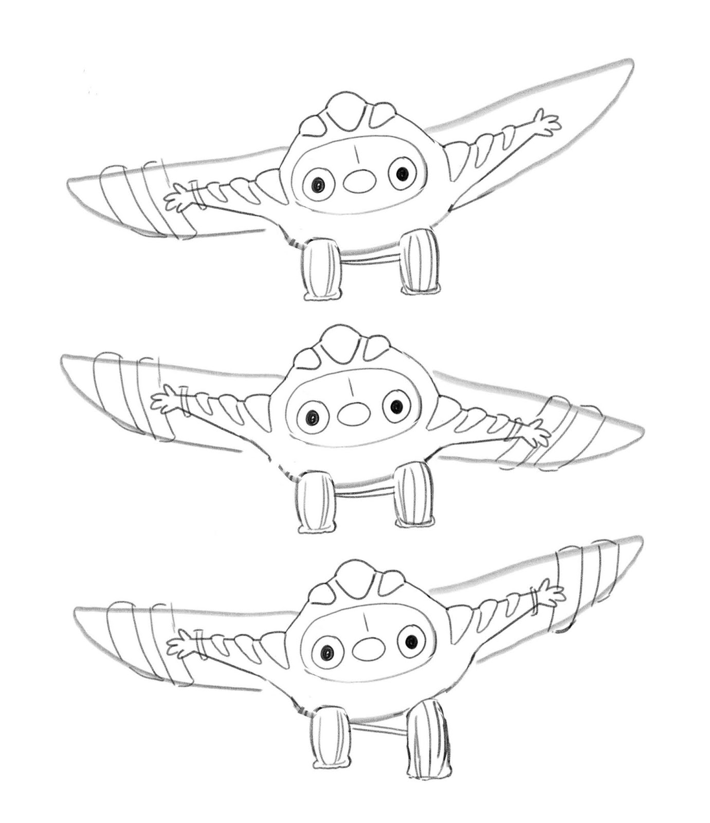
Over the past few days, I played around with the composition but after rereading the brief, I decided focusing on a singular character would be better suited. one of the characters on the totem pole stood out to me and I chose to develop this concept, turning him into a little monster who pretends he's a plane. When creating characters, I always overcomplicate them so I tried to focus on a simpler but more effective concept.
 |
| Totem Pole concept
With a clearer idea of the character, I started altering the positions of the wings and wheels to give the impression of him stumbling and coming into land. I like how the character's personality is shown through his actions as his facial features are very simplistic and don't give off a singular emotion leaving the audience to connote what the character is feeling. When I started colouring the wings and smaller features in red and blue, I decided to leave the character white as it makes his features stand out with the contrast in colours. With his white body, it connotes innocence and how he may feel like he blends in so learning to fly will help him stand out. I always try to generate a story to give more depth so the viewer can relate and it creates a connection, hopefully this feature will help my character stand out among all the others on the Pictofolio website!
|
 |
| Final character- Wilbur, 'Learning to Fly' |

Comments
Post a Comment